 Your new post is loading...
 Your new post is loading...

|
Scooped by
Robin Good
November 13, 2011 10:47 AM
|
TypeChart is a classy online typography guide to fonts and typefaces for the web. You can browse through the best Windows and Mac fonts and see exactly how they look on each platform while being able to immediately grab and download the related CSS style sheet.
Very useful. 9/10
http://www.typechart.com/

|
Scooped by
Robin Good
November 10, 2011 6:28 AM
|
Don Norman writes in this long-form seminal article about the critical need for Design Education to "upgrade" itself and to recognize the need for designers to embrace and study complementary arts and sciences which are so critical today to their success.
He writes: "Design education needs to change, yet still keep its essential character.
Otherwise, the graduates of design programs will continue to be regarded professionally as second class citizens.
Designers today are seldom asked to take part in major decisions.
This will not change until designers become knowledgeable in matters of the world, of business and politics, of social forces and of modern technology.
If designers wish their ideas to have major impact, their educational base needs to be broadened.
It is time that design education entered the 21st century."
...
"The products and services have complex interactions that have to be self-explanatory, sometimes involving other people separated by time or distance.
Traditional design activities have to be supplemented with an understanding of technology, business and human psychology.
With all these changes, one would expect major changes in design education.
Nope.
Design education is led by craftspeople who are proud of their skills and they see no reason to change. Design education is mired in the past."
Must read. 9/10
Read the full article here: http://www.core77.com/blog/columns/design_education_brilliance_without_substance_20364.asp

|
Scooped by
Robin Good
November 6, 2011 4:17 AM
|
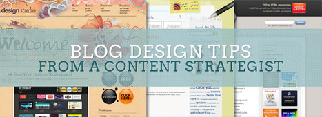
Brad Shorr goes a long way to explain clearly what are some of the most critical aspects of designing a blog, while keeping your attention not just on "looks", but also on what will make your readers be satisfied and wanting to come back for more.
Excellent recommendations, questions and visual examples.
Right on target. 8/10.

|
Scooped by
Robin Good
November 2, 2011 5:52 PM
|
Robin Good: If you are looking for a solid set of basic web resources where to acquaint yourself with user interface design practices, examples, reources and techniques you can take advantage of this essential curated "superguide" created by Kelli Shaver for Mashable.
The guide showcase nine essential resources that I have been referring for years and which I myself find irreplaceable.
Recommended. 9/10

|
Scooped by
Robin Good
November 2, 2011 6:37 AM
|
From the article: "As important a role as design plays in the perception of and reaction to your content, people still argue that a user experience cannot truly be designed.
Of course, the user ultimately decides how they engage with any design.
If the goal of a design is to convert every single user into a customer, then failure is the only outcome.
We can, however, design an experience that connects immediately with a target audience, delivers information with a clear tone and purpose, and encourages a response."
This in the essence is what "UX" or "user experience" is all about.
This in-depth article from SmashingMagazine touches on some of the key aspects of creating effective user experiences by providing many visual examples and references.
Recommended. 8/10.

|
Scooped by
Robin Good
October 30, 2011 3:06 PM
|
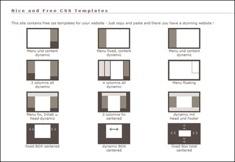
A great "superguide" showcasing a full spectrum of bare CSS Layouts for web design.
Well curated and organized, I find this to be an extremely useful resource and reference for any professional web designer.
Recommended. Very useful. 9/10
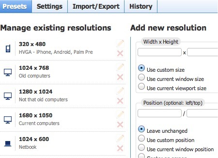
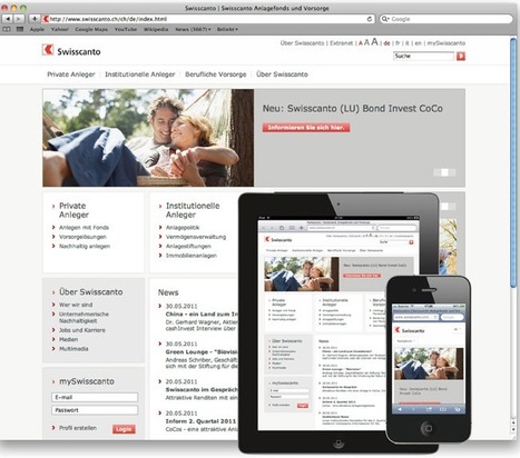
Screen resolution nowsaday ranges from 320px (iPhone) to 2560px (large monitor) or even higher. Users no longer just browse the web with desktop computers. Users now use mobile phones, small notebooks, tablet devices such as iPad or Playbook to access the web. So the traditional fixed width design doesn't work any more. Web design needs to be adaptive. The layout needs to be automatically adjusted to fit all display resolution and devices. This tutorial will show you how to create a cross-browser responsive design with HTML5 & CSS3 media queries.
Via Rebeca Zuniga

|
Scooped by
Robin Good
October 24, 2011 4:59 AM
|
Here are five stunning web and five mobile user interface designs from which to take inspiration.
Worthwhile keeping them as a good design reference.

|
Scooped by
Robin Good
October 18, 2011 2:25 AM
|
As a content specialist, I prefer web designs that support content rather than conflict with or ignore it.
For blog design, content issues are particularly important to pay attention to, because, fundamentally, the purpose of a blog is to deliver quality content to a strategically defined audience or community.
For that reason, web design and content must never work at cross-purposes.
Here are a few tips for web designers creating weblogs.

|
Scooped by
Robin Good
October 16, 2011 12:54 AM
|
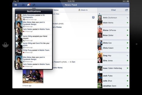
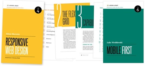
Responsive web design is the future of web design. It won't be long till we see an HTML5 design from Facebook that delivers an almost identical user experience across both the desktop and multiple devices.
Responsive web design was a term coined by Ethan Marcotte on A List Apart (a long running and popular resource for web designers) in May 2010.
He coined it in response to the increasing number of devices and browsers on which to view a website, which was kickstarted with the iPhone in 2007 and has since expanded to include the likes of Android and Internet TV browsers. As Marcotte wrote, "in short, we're faced with a greater number of devices, input modes, and browsers than ever before."
Marcotte followed up with an entire book on the topic. It should also be noted that Marcotte initially advocated a specific method for responsive design, but Jeffrey Zeldman (whose company published the book) clarified in July of this year that "our understanding of "responsive design" should be broadened to cover any approach that delivers elegant visual experiences regardless of the size of the user's display and the limitations or capabilities of the device."
Here we’ve gathered a collection of web designs that make good use of color.
In these examples you’ll notice some using color to highlight and draw attention to specific elements, while others use larger amounts of color to set the over all tone of the site.
Via Rebeca Zuniga

|
Scooped by
Robin Good
October 12, 2011 11:33 AM
|
In the last year, technologies have emerged that solved a lot of problems in web design.
For example, TypeKit enables designers to support non standard fonts, so all of a sudden designers can play with hundreds, if not thousands of different type faces.
Taking user experience into consideration, along with flawless site design and and exceptional product, we’ve brought together 10 of the smartest looking sites out there.

|
Scooped by
Robin Good
October 12, 2011 11:27 AM
|
|

|
Scooped by
Robin Good
November 11, 2011 2:45 AM
|
From the article intro:
"As a Web design student you’re constantly learning new and often complex concepts that can sometimes seem overwhelming.
You’ll need all of the tools possible in order to help you learn and to also make your job easier.
With Google Chrome’s speediness and growing popularity, it’s a perfect browser for Web design students to get their feet wet with.
This list of extensions are especially great for Web designers just starting out. They’re not only easy to use, but they will also help inspire students and make learning fun."
Read more: http://www.friedbeef.com/best-google-chrome-extensions-for-web-design-students/

|
Scooped by
Robin Good
November 9, 2011 4:11 AM
|
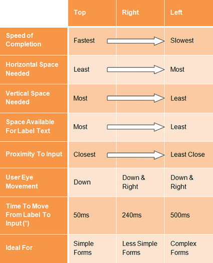
"Contrary to what you may read, peppering your form with nice buttons, color and typography and plenty of jQuery plugins will not make it usable.
Indeed, in doing so, you would be addressing (in an unstructured way) only one third of what constitutes form usability.
In this article, you will find practical guidelines that you can easily follow. These guidelines have been crafted from usability testing, field testing, website tracking, eye tracking, Web analytics and actual complaints made to customer support personnel by disgruntled users."
The full guide: http://uxdesign.smashingmagazine.com/2011/11/08/extensive-guide-web-form-usability/

|
Scooped by
Robin Good
November 3, 2011 5:13 PM
|
Here is a great "superguide" to excellent typography-related, CSS-compatible tools to help you find, select, test, measure, compare and use the best fonts for your web design work.
Very useful. 8/10

|
Scooped by
Robin Good
November 2, 2011 12:02 PM
|
From the article: "Web design is in bad shape. In the applications boom, news-related websites end up as collateral damage.
For graphic designers, the graphics tools and the computer languages used to design apps for tablets and smartphones have unleashed a great deal of creativity.
...
For advertising, the equation is straightforward. The exponential rise of inventories coupled to fragile economic conditions have pushed ad agencies to ask more (space) for less money.
And, for creativity, progress has been flat.
The weird thing is this: On the one hand, web designers seem to work on increasingly large monitors; on the other, the displays used by readers tend to shrink as more people browse the web on notebooks, tablets or smartphones.
The result is a appalling when you try to isolate content directly related to the news."
Great real world examples of ads overriding content: useful. 8/10

|
Scooped by
Robin Good
November 1, 2011 3:34 AM
|
From the article: "Responsive Web Design isn't a silver bullet for mobile Web experiences.
Not only does client-side adaptation require a careful approach, but it can also be difficult to optimize source order, media, third-party widgets, URL structure, and application design within a RWD solution.
Jason Grigsby has written up many of the reasons RWD doesn't instantly provide a mobile solution especially for images. I've documented (with concrete) examples why we opted for separate mobile and desktop templates in my last startup -a technique that's also employed by many Web companies like Facebook, Twitter, Google, etc. In short, separation tends to give greater ability to optimize specifically for mobile."
Luke Wroblewski provides an insightful review of the status of RWD and of which are the challenges yet to be met by those who have or are planning to use it.
Informative. Resourceful. 8/10

|
Scooped by
Robin Good
October 27, 2011 6:11 PM
|
My take: Great, professional, up-to-date, usable advice by Adrian Jones. Recommended. This guy knows what he's talking about. No fluff, just good stuff. 9/10
From the article intro: "I have a secret to share.
I’m a sucker for a beautiful looking website. But the truth is, at the end of the day, a site’s visual aesthetics will more than likely have nothing to do with it’s success or failure.
If a site looks good, my attention is captured and I can take pleasure in the design, but then it quickly boils down to whether the site can do for me what I want it to.
Key factors for determining a website’s success are its usability and utility.
Content is king, of course, but content needs to be found and accessed.
So I hope that you will consider these 5 principles of user-centered interface design on your current and future projects.
There are, of course, many more principles than just these five, but that’s what books on UX design are for."

|
Scooped by
Robin Good
October 24, 2011 1:31 PM
|
Here is a great collection of 20 websites you can use as good reference for web and user interface design.
You probably know that there are so many websites out there, it's like there was a Big Bang on the Internet in the past few years and websites&blogs appeared even more faster than mushrooms after rain.
Via Rebeca Zuniga

|
Scooped by
Robin Good
October 18, 2011 1:36 AM
|
Foundation, a new framework for web design, helps you make beautiful, consistent experiences across all kinds of personal computers, TVs and mobile devices, including tablets and a range of smartphones.

|
Scooped by
Robin Good
October 15, 2011 5:43 PM
|
Dissonance occurs when something disrupts your consonance. It challenges your beliefs and makes you feel uncomfortable. We can use it in design or copywriting.

|
Scooped by
Robin Good
October 12, 2011 11:44 AM
|
From Rand Fishkin: "It's been a long time since I've written about design here at Moz, but I spent my morning in a great meeting with Derric, and was inspired by a lot of his ideas and what we reviewed to revisit some of the emerging trends and outlier creatives that are opening our eyes to what's possible.
Below, you'll find some truly exceptional, unique elements of creative layout and artistry, as well as simple tweaks to best practices that are pushing the field forward.
Hopefully, a few will inspire your design directions, too!"

|
Scooped by
Robin Good
October 12, 2011 11:26 AM
|
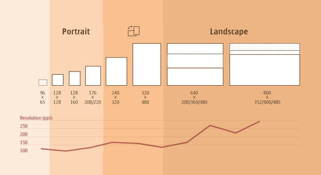
If you’ve been working in the web design field for the past couple of years you should know that designing a fixed interface for a widescreen computer is not enough.
Most of the clients you’ll be dealing with from now are going to request that their site is not only desktop-compliant but is also optimized for smartphones and tablets.
This issue presents the necessity of working with different screen resolutions in order to guarantee that a website looks good in all sorts of devices.
But if the devices’ production continues at the same speed that it has for the past couple of years, the amount of screen resolutions and formats that designers will have to deal with is going to become unbearable.
This article is about the solution: responsive web design.
|


 Your new post is loading...




![Responsive Design with CSS3 Media Queries [Tutorial] | The Web Design Guide and Showcase | Scoop.it](https://img.scoop.it/DISgNwxygsEmyl6YJBPQITl72eJkfbmt4t8yenImKBVvK0kTmF0xjctABnaLJIm9)

