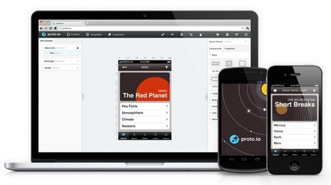
Screen resolution nowsaday ranges from 320px (iPhone) to 2560px (large monitor) or even higher. Users no longer just browse the web with desktop computers. Users now use mobile phones, small notebooks, tablet devices such as iPad or Playbook to access the web.
So the traditional fixed width design doesn't work any more.
Web design needs to be adaptive. The layout needs to be automatically adjusted to fit all display resolution and devices.
This tutorial will show you how to create a cross-browser responsive design with HTML5 & CSS3 media queries.
Via Rebeca Zuniga


![Responsive Design with CSS3 Media Queries [Tutorial] | The Web Design Guide and Showcase | Scoop.it](https://img.scoop.it/DISgNwxygsEmyl6YJBPQITl72eJkfbmt4t8yenImKBVvK0kTmF0xjctABnaLJIm9)


 Your new post is loading...
