


Research and publish the best content.
Get Started for FREE
Sign up with Facebook Sign up with X
I don't have a Facebook or a X account
Already have an account: Login

The Web Design Guide and Showcase
32.8K views |
+1 today
Examples, tutorials, insight and non-technical news about designing effective web pages
Curated by
Robin Good
 Your new post is loading...
 Your new post is loading...
Your new post is loading...
Robin Good's insight:
Just yesterday I was looking for some of the less popular typefaces that could convey a more informal and personal communication style for a video presentation. Sammy Maine, at Creative Bloq, has done an excellent curation job by gathering, selecting and introducing over 30 quality handwriting fonts that can be utilized in many different situations. Useful visual list of handwriting style fonts. 7/10


nat silent's curator insight,
July 18, 2014 10:36 AM
Handwriting fonts have been gaining more popularity over the past few months, so we decided to pick 36 of the best free ones.
Robin Good's insight:
A valuable curated selection of fourteen different online resources which provide web design, UI and user onboarding inspiration, examples and best practices to their readers. Kudos to Danny Schreiber on the Zapier blog for curating this excellent set of resources. If you are into web design, web marketing or in learning rapidly from others what works on the web, you must bookmark this stuff and share it with your networks. Very valuable. 8/10 Full article: https://zapier.com/blog/user-onboarding-user-interface-inspiration/
Robin Good's insight:
GoodUI offers a growing catalog of web design tips and UI ideas that can be immediately put to use. Excellent tips, and suggestions. Easy to understand, well presented. Recommended. Free to browse. Check it out now: http://goodui.org/ GoodUI is a project by Jakub of Linowski Interaction Design

Giuseppe Bonanno's curator insight,
March 26, 2014 4:42 AM
Un lungo e dettagliato elenco di consigli utili per l'ottimizzazione di landing page e, in genere, di pagine web finalizzate a una conversione.
Robin Good's insight:
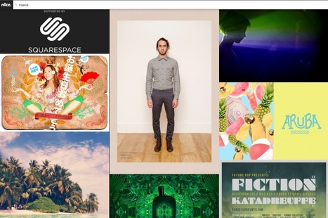
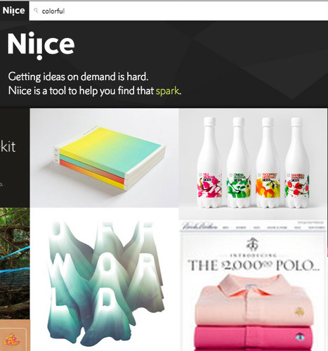
Niice is a new search engine that specializes in retrieving high-quality images from a curated set of design sites which include for now Behance, Illustration age, Designspiration, SiteInspire & Fonts In Use. Niice can be used as a visual trigger to find interesting and inspiring visuals on just about any theme or topic. The curated nature of its sources and of the images allowed into the index guarantees that your focus area will always be filled by visually interesting ideas. I tried a few simple searches, and was quite inspired by the quality of the results. I'd say truly inspiring. http://www.niice.co/?search=rome http://www.niice.co/?search=brass http://www.niice.co/?search=tao Free to use. Try it out now: http://www.niice.co/
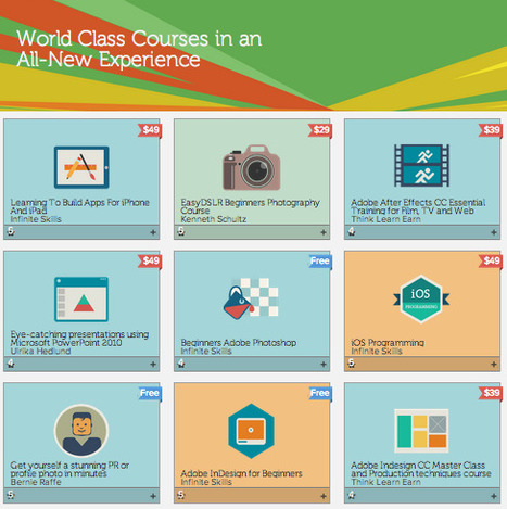
Adobe KnowHow - World Class Courses in an All-New Experience
Robin Good's insight:
Adobe has opened up an online academy for learning most anything from building mobile apps, to Photoshop, design, PowerPoint presentations and more. There are already over 75 different courses available, and besides a few free Adobe introductory ones (Photoshop for beginners), all other courses are have a price tag ranging from $19 to $99 per course. You can pick and select courses you would like to take and save them in a wish list. Each course provides a sneak preview, and includes multiple video modules on the selected topic. Creativeblog reports: "With Adobe KnowHow you can also markup or add notes on the video as you're watching; making it even easier to master that new skill. You can also jump to cue points created by your annotations to review both your notes and the associated video content, so you'll be up to date all of the time." Source: http://www.creativebloq.com/adobe/adobe-makes-tutorials-available-free-11135249 Check it out now: https://www.adobeknowhow.com/

Almudena Cano's curator insight,
November 21, 2013 2:33 PM
Adobe ha abierto una academia online.
En la Academia Adobe podemos encontrar más de 70 cursos, gratuitos y de pago, para aprender desde creación de apps hasta crear presentaciones de PowerPoint pasando por un curso de Photoshop, entre otros.
Cada curso ofrece una breve introducción y diferentes vídeos para un profundo detalle sobre los contenidos ofrecidos.
Los cursos ofrecen múltiples herramientas y opciones para añadir notas, agregar marcadores, etc.
Infórmate en: https://www.adobeknowhow.com/ ; Las clases del futuro que ya son presente.
Robin Good's insight:
A pretty amazing one-page with scrolling parallax. If you are looking for inspiration or to discover things you have probably not seen yet on a web page, here is a great example.

José Gil de Sagredo's curator insight,
October 13, 2013 7:03 AM
Una página increíble con desplazamiento paralaje. Si buscas inspiración y descubrir cosas que probablemente no has visto todavía esta página web un buen ejemplo 
Gael's curator insight,
December 9, 2013 7:42 AM
Great example of digital experience you can create with parallax scrolling !
Robin Good's insight:
If you need to find out what font has been used in a specific ad, logo or creative display, here are three free tools that you can use to identify the original typeface. MyFonts.com WhatTheFont and Whathefontis.com are two free web apps which allow you to upload a screenshot of the text that contains the font that you need to identify. Once the image is uploaded you simply need to help the software identify different characters by suggesting what letters are present in the original text. At this point the service will suggest and display a number of typefaces that come closest to the character traits of the image you have submitted. A third alternative, Identifont.com, allows you to search and find typefaces by searching them by name, style/look, author or symbols contained in it. Three apps to keep in your creative designer toolkit.

Intriguing Networks's curator insight,
July 1, 2013 6:34 AM
what is that Font, use free tools to find out
Robin Good's insight:
Niice is a new highly specialized search engine, tapping into the heart of three first class design & inspiration sites: Dribbble, Designspiration and Behance. If you are looking for design inspiration on just about anything, search with Niice and you'll likely find some wonderful references, if not a designer or illustrator to hire right now. Excellent design resource. Free to use. Try it out now: http://www.niice.co/

Paco Arcoleo's curator insight,
April 21, 2013 9:07 AM
Niice motore di ricerca per design ispiration! Niiiice :) 
Jorge Forero's curator insight,
July 28, 2013 10:51 PM
Buscando Inspiración en Diseño?
síguenos en facebook: https://www.facebook.com/dweb3d/
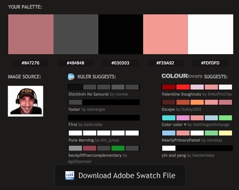
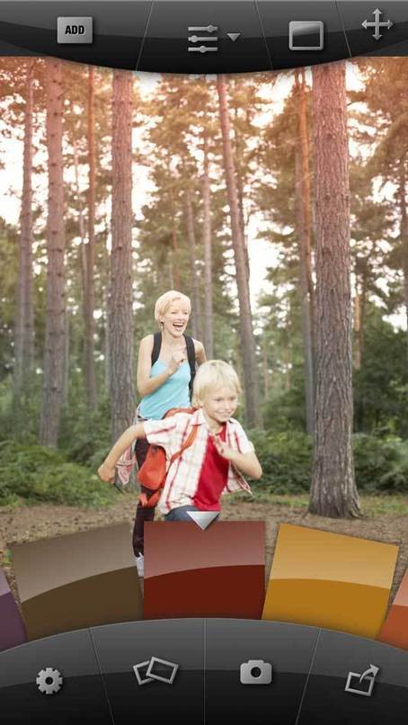
Generate a color palette from PNG, JPG or GIF image/photo. Receive color suggestions, download Photoshop swatches (.ACO)
Robin Good's insight:
Pictacolous is a free color palette generator which allows you to easily find matching color schemes for any image you submit. Courtesy of Mailchimp (the email newsletter distribution service) the new free service analyzes your image (any JPG, GIF or PNG not larger than 500K) for individual colors before tapping into Adobe Kuler and ColourLovers public collection of color palettes and suggesting the most relevant ones. Essential. Simple. Very useful. Try it out now: http://www.pictaculous.com/
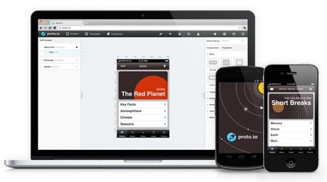
From
proto

Build high-fidelity fully interactive mobile app prototypes in minutes. Prototypes can be viewed on browser or device giving a real experience to the user how the app will look like and behave.
Robin Good's insight:
Turn your wireframes and designs into interactive prototypes that you can actually see, in the same way that your users will with Proto.io. See exactly how your app will work and look. Swipe, tap, rotate and examine your app inside out the same way your end user will. Proto.io is also the first web protoyping tool that supports full feature animations and touch events. Proto.io is an excellent platform to prototype your new app across all kinds of devices and screens from smartphones, to smart TV. refrigerators, car screens, etc. Basic free account available. Examples: http://proto.io/en/examples/ Features: http://proto.io/en/features/ Pricing: https://proto.io/en/signup/ Tutorials: http://docs.proto.io/tutorials/ Help: http://docs.proto.io/ Find out more: http://proto.io/
Robin Good's insight:
Michael Locke highlights with some valuable visual exmaples, five UI design trends that characterize beautiful, clean designs. These are: 1) Large Image Backgrounds 2) One Page Designs 3) Textures, patterns and noise 4) Responsive Web Design 5) Flat UI Design Original video: http://youtu.be/bKrY0o_3TqU Original article: http://www.mlwebco.com/2013/03/12/my-top-5-favorite-web-ui-design-trends-for-2013/
Paco Arcoleo's curator insight,
March 15, 2013 12:00 PM
Trends del design di UI (User Interface) nel 2013 
Trompetista De Jazz's curator insight,
March 15, 2013 12:17 PM
Visita Dweb3d.com Diseño web en Colombia
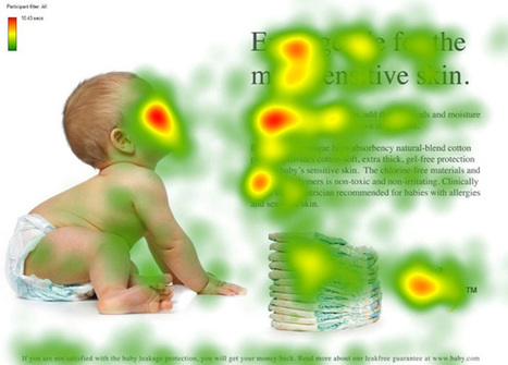
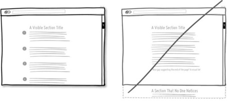
They say a picture is worth a thousand words. True or not, images are an important part of any website we create. Since it is so easy to embed an image in a website (even the process of creating your
Robin Good's insight:
If you want to learn how to use images effectively inside your website or blog here is a truly excellent guide by Chistian Vasile on 1WD. In the guide you will find rational and fact-supported advice on how to choose, place and test image use inside web-based content as well as lots of extremely relevant examples of effective image use online. From the original article: "...if you manage to find the right pictures and insert them in the right places, they can do wonders for you, as they did for some others." Well written. Informative. Resourceful. 8/10 Full guide: http://www.1stwebdesigner.com/design/images-on-web-design-usability-guide/

Martin (Marty) Smith's curator insight,
March 9, 2013 2:54 PM
Confessions of A Director of Ecommerce 2. Gaze directly at a Call To Action - promotes clicks. 3. Gaze at other people in same picture - promotes connection.
We used #1 for pages with broad reach such as our homepage and category top-level pages. Websites communicate SO MUCH in covert ways. Balancing what you say with one image such as the people looking at each other with another image to promote engagement is the game you play, the inside baseball "secrets" that separate teams capable of making millions in profits online from those who won't and wonder why :).M
|
Robin Good's insight:
Niice is a curated visual search engine providing design inspiration and the ability to easily clip, collect and organize your favorite designs into visual collections or mood boards. To guarantee high quality visual results Niice taps some of the best curated design hubs available online: Behance, Designspiration, Fonts in Use and Brand New. Once you have queried Niice with a specific keyword, color, theme or style, collecting your favorite designs is as easy as clicking the plus button appearing on top of each image. You can pick and choose in which collection your selected image will go and you can easily rearranging images in a mood board by simply dragging and dropping. The basic service is free and it allows you to search, collect and organize up to 5 mood boards. Paid plans add the option to see no banners, to upload your own content, to have images backed up, and to export full image boards as a JPG image. If you are a web designer looking for inspiring visuals, ideas, logos and other creative work, Niice is a fantastic resource to use. Free to use. Try it out now: http://niice.co/ Chrome plugin: http://n.iice.co/niiceplugin (to collect images from the web)
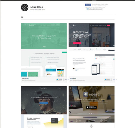
Robin Good's insight:
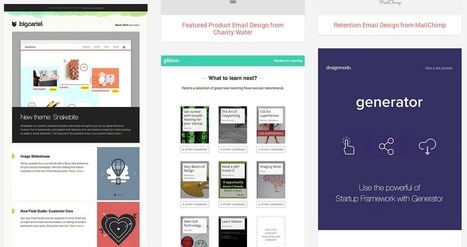
Book Land is an inspiring collection of 240+ product landing pages organized chronologically and by different tags/categories. Given the amount of low quality collections, and the time that it takes to scour the web to find good, inspiring examples like these, Book Land is a useful and refreshing design inspiration gallery to save for future use. Clean, easy to browse, inspirational. Free to use. Updated weekly. Check it out now: http://land-book.com/ Suggest new pages: http://land-book.com/suggest/ Feed RSS: http://land-book.com/feed/ Created by Dawid Liberadzki, Konrad Księżopolski and Marcin Wieprzkowicz.
Robin Good's insight:
Wirify is a very useful tool for web designers and anyone interested in analyzing and improving a web site organization and layout. In one click Wirify is capable of rendering any web page into a simplified sketch outlining how the space on the page is being utilized, by hiding the actual contents and replacing them with graphic placeholders. To use Wirify you install a simple bookmarklet on your browser bookmark bar and then, anytime you want to transform a web site you are looking at into a wireframe, you can do so by clicking the Wirify bookmarklet. Free to use. Pro version available allowing wireframe export to other apps like Omnigraffle, Visio and Balsamiq as well as in the standard .SVG vector format. via Mirko D'Isidoro
Robin Good's insight:
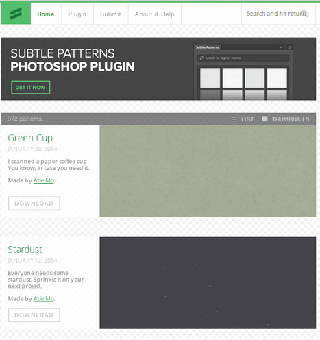
SubtlePatterns is a curated collection of high quality background graphic tilable textured patterns. Free to use, created, curated and maintained by Atle Mo. Try it out now: http://subtlepatterns.com/ Photoshop plugin: http://plugin.subtlepatterns.com/ Submit your own pattern: http://subtlepatterns.com/submitpattern/
nat silent's curator insight,
July 19, 2014 4:20 PM
SubtlePatterns is a curated collection of high quality background graphic tilable textured patterns.
Free to use, created, curated and maintained by Atle Mo.
Try it out now: http://subtlepatterns.com/ ;
Photoshop plugin: http://plugin.subtlepatterns.com/ ;
Submit your own pattern: http://subtlepatterns.com/submitpattern/
Recently I have spent my some time on internet to maintain a list of some highest quality and most effective web design blog around web world. I was searching
Robin Good's insight:
If you are looking for web design inspiration, news, tutorials and advice here is a good list of the top 15 web design blogs available out there. Useful. Resourceful. 7/10 Full article: http://webrevisions.com/web-design/15-high-quality-web-design-blogs-of-all-time
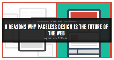
Pageless design frees websites from the outdated conventions of print design and fully utilizes the digital platform they’re built on.
Robin Good's insight:
If you have not heard before about pageless design, this term refers to those websites made up of just one, long page providing all of the content needed to present a product, issue or company. Nathan B Weller suggests in tis article eight great reasons to use pageless design. My comment: There are many situations in which a pageless design can provide greater simplicity, more engagement and conversions, especially when elements of storytelling and covering multiple aspects of a topic are used. Informative. Instructive. 8/10 Full article: http://www.dtelepathy.com/blog/design/8-reasons-why-pageless-design-is-the-future-of-the-web

Elizabeth Bowden's curator insight,
October 29, 2013 7:46 AM
Smart sites instead of web sites. Instead of scattering your story on several different pages (About, Mission, etc.) users simply scroll.
Robin Good's insight:
If you want to learn the essence of the history of typography this short video clip can do the job. Created by Ben Barrett-Forrest Information Sources: Original video: http://youtu.be/wOgIkxAfJsk

Belinda Summers's comment,
September 3, 2013 5:01 AM
I learned a lot from this video, thanks for sharing!
Robin Good's insight:
A must try-out tool for web designers.
Paco Arcoleo's curator insight,
May 13, 2013 3:49 PM
Strumento davvero fichissimo per creare mag interattive: ReadyMag 
McSotos's curator insight,
April 11, 2014 12:20 AM
Στους δασκάλους και δασκάλες που προετοιμάζονται για πλήθος εκδόσεων.
Robin Good's insight:
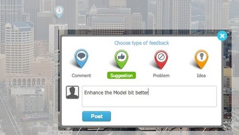
If you are looking for an effective tool to help the review of design drafts, providing the ability to add comments, suggestions, to highlight problems or to contribute new ideas, Concept.ly is definitely worth a try. This new web app allows you to upload just about any type of image file that needs to be showcased, organize it with other related files and to share it with your selected teammates or customers. Key additional features include: - Compare multiple designs back to back - Support for mobile devices - Link different images and pages easily - Track progress and statistics - Full support for Dropbox, GDrive, Box. P.S.: Free to use for a lifetime if you join the beta program now. Try it out here: http://concept.ly/ Tour: http://concept.ly/features.html

Brian Yanish - MarketingHits.com's curator insight,
April 10, 2013 11:24 AM
Interesting, I'll have to give it a try.
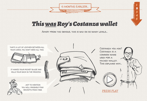
In “Storytelling in Web Design,” I explained the three most basic aspects of storytelling — character, setting, and action — and offered ways to begin including storytelling in web design using basic design elements..."
Robin Good's insight:
Here are ten illustrated examples of how storytelling can be an integral part of any web design and communication strategy. For each one of these you also get to know the character, setting, and action found in each story. Very useful. Excellent examples. 8/10
From sketching on the go to choosing colours and fonts, these awesome iPhone apps will speed up your workflow and help you make the right design choices. Via Brian Yanish - MarketingHits.com
Robin Good's insight:
Good short info about many apps I didn't know about. Reference of price, author and download/buy link. Very useful. 7/10 Original list: http://www.creativebloq.com/design-tools/best-iphone-apps-812522
Brian Yanish - MarketingHits.com's curator insight,
March 19, 2013 6:29 PM
Find some great app in this article.
Paco Arcoleo's curator insight,
March 28, 2013 6:08 PM
Certo l'iPhone come display limita parecchio, però si sà siamo sempre più smanettoni! un pò tutti!!! :D
Gridset is a tool that allows you to create sets of grids for your site.
Robin Good's insight:
Gridset is a commercial web-based app for web designers for making grids, designed and built by the team at Mark Boulton Design. Gridset allows you to create grids for a number of different breakpoints. Each grid can be different – from ratio grids, to simple column grids. This set of grids is then compiled to one fully responsive CSS file for your site. From the official site: "With responsive design forcing us into working and thinking differently about web layouts, the maths involved in designing for a plethora of different screen sizes started to take up valuable time and cause more than a few headaches. We were hitting the same hurdles as everyone else. So when we looked to the web for a tool to help simplify the process and realised there wasn’t anything out there, we decided to make our own. And that’s how Gridset came to be." Free 30-day trial Features: https://gridsetapp.com/features/ Examples of grids: https://gridsetapp.com/#specimens Pricing: https://gridsetapp.com/pricing/ FAQ: https://gridsetapp.com/faq/ Find out more: https://gridsetapp.com/
|


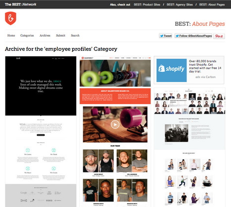
Jeremy Mitchell, an art director, web designer & filmmaker, is also the curator of a small network of website collections that showcase the best examples of *about pages*, *product web sites* and *agency sites*: The Best Network.
Each site is a visual gallery of real-world examples of web pages fitting the site theme and organized across a number of relevant (though not always so coherent) categories.
A great example of non-commercial content curation, done for the purpose of creating a useful public reference as well as a high-value piece of content boosting the credibility and reputation of the author.
Free to use.
Check them out now: