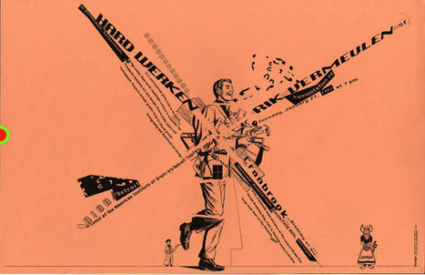
From the article intro:
"Successful design in publishing, advertising, web design, illustration and anything else that ties together elements depends on drawing in the reader and leading their eyes across the page.
Some people think it’s not a big deal and that designing a page comes naturally because of cultural lessons we learn growing up and looking at design from childhood yet few, if any understand why it works the way it does."
In reality things are not simple, natural or obvious, especially if, you are in the group of those who do not just want to follow the mainstream standards but who like to break out of conventions and innovate while bringing greater value.
But how do you achieve that, unless you are already a great designer?
What are the rules that can be broken?
This good article by Speider Schneider provides some good basic advice, on what is needed to head properly in this direction.
Full article: http://www.instantshift.com/2012/01/06/focal-points-in-design-layout/
(Reviewed by Robin Good)


 Your new post is loading...


