Measuring the Networked Nonprofit
24.1K views | +1 today
Follow
Measuring the Networked Nonprofit
Best links and resources for improving practice and proving results.
Curated by Beth Kanter
Your new post is loading...
Rescooped by Beth Kanter from Marketing Strategy and Business
Scoop.it!

7 Key Design Tips for High-Converting Landing Pages | HubSpot

7 Key Design Tips for High-Converting Landing Pages | HubSpot | Measuring the Networked Nonprofit | Scoop.it

Excerpted from article by HubSpot:

"Landing pages are a fundamental -- and undeniable -- part of a sucessful inbound marketing strategy. They are the hub of your lead generation efforts, and that's why every campaign you run and offer you create should be tied to a custom landing page -- as opposed to an ambigious homepage where visitors have to guess what to do next.


So to help you build good looking and high-converting landing pages, we wanted to share some design-related best practices.


1) Get to the point.
We all know people have short attention spans -- so why aren’t we considering that in landing page creation?
So when designing your landing pages, get straight to the point. People came to the page for a reason, so make sure you address that reason clearly and succinctly by highlighting the value of what you're offering and how it addresses their needs, interests, or problems.

2) Use contrasting colors.
Keep in mind that you always want your main call-to-action (CTA) to really POP off your landing page. So when you're encouraging visitors to fill out a form and click on that 'submit' button, make sure it's easy for visitors to see where they should complete that action. That's why using complementary and contrasting colors is a great way to call a visitor's attention to exactly where you want it.

3) Stamp on a logo.
Keep your brand top of mind when they're downloading your content and offers by making sure the viewer knows exactly where they are. All your landing pages should have your logo placed strategically on the page.

4) Avoid visual clutter.
While displaying extravagant visuals on your landing pages may sound like a fabulous idea, oftentimes it distracts the reader from the main point of the landing page, creation more friction on the landing page instead of supporing conversion.

5) Never underestimate formatting.
Formatting is probably the easiest design best practice to follow when crafting good-looking landing pages. It's also one that can go a really long way with little effort. Clearly laying out your headlines, images, copy, form, etc. can help you highlight the value of your offer and tee up conversion by creating a visual-friendly user experience that guides visitors to complete the conversion.

6) Add social proof.
This adds third-party credibility to your content and offers and can help boost conversions. Do you have any case studies or testimonials you can pull quotes from? Furthermore, try searching through social networks like Twitter, Facebook -- or another social platform of your choice! Consider embedding tweets from users who have downloaded your content and said nice things about it, or asking if you can quote someone who left a nice message on your Facebook page.

7) Be consistent.
A sense of consistency can help the end user know how to navigate your pages over time, eliminating the friction caused by having to get the lay of the land each time, and resulting in drop offs in conversion rates.

Each tip is analyzed with more information and examples.

Read full original article and download 79 free landing page templates here:
http://blog.hubspot.com/7-landing-page-design-tips


Via Giuseppe Mauriello
malek's curator insight, April 14, 2013 5:55 PM

Design best practice

Marc B.'s comment, April 20, 2013 7:09 PM
These are great tips. I think numbers 1 & 4 are the most important. If web visitors are not distracted by other visuals (#4) they want you to give them what they are asking for without the jargon and theory etc.
Rescooped by Beth Kanter from Google Analytics & Tracking
Scoop.it!

How To Track Social Media Conversions in Google Analytics

http://BasicBlogTips.com Google Analytics is updated to include social measurement reports. First you must set up Goals on your Admin dashboard so that you can access which social networks are converting.


You can download the slides at http://www.slideshare.net/Ileane/


Watch the Google Analytics Workshop: http://www.youtube.com/watch?v=fjaijt13e1U


Via jimbanks, Marcela De Vivo
Marcela De Vivo's curator insight, January 23, 2013 2:51 AM

I'm curious about what are goals to track and set up, and how to use the data to help wtih decision making with the overall campaign.

Scooped by Beth Kanter
Scoop.it!

7 Secrets of Social Media Conversion [Infographic] – Full Size View | Unbounce

7 Secrets of Social Media Conversion [Infographic] – Full Size View | Unbounce | Measuring the Networked Nonprofit | Scoop.it
Beth Kanter's comment, August 4, 2011 12:44 PM
Useful diagram to explain the process, help map out a ladder of engagement and metrics to track. Also can be useful to figure out how and where A/B testing fits in.
Rescooped by Beth Kanter from Internet Marketing Strategy 2.0
Scoop.it!

How To Create a Landing Page That Really Converts: Key Ingredients and Good Examples

How To Create a Landing Page That Really Converts: Key Ingredients and Good Examples | Measuring the Networked Nonprofit | Scoop.it

Excerpted from article:
"If you don’t have a good landing page, it’s like going fishing without a net: you might land a big one on your hook, but you won’t be able to drag it into the boat.

You don’t want people to just visit your page. You want them to take action once they are there. So make it as easy and compelling as possible for them by including these elements found in a landing page that CONVERTS:

C = Clear Call to Action
O = Offer
N = Narrow Focus
V = VIA: Very Important Attributes
E = Effective Headline
R = Resolution-Savvy Layout
T = Tidy Visuals
S = Social Proof

CLEAR CALL TO ACTION:
Whatever it is you’ve decided will move people further along your conversion funnel. That’s what you should be asking them, clearly and temptingly, to do. Don’t distract them with lots of other requests. The best pages accentuate only one CTA.

OFFER:
An offer is anything you give your visitors in exchange for getting them to do what you want. This can mean offers in the traditional sense of coupons or discounts, but it also can mean a free trial, a free version of the product, a whitepaper, or a matching gift.

NARROW FOCUS:
Research has shown that the more choices you offer people, the longer they take to make a decision. So the clearer and simpler you make your page, the more likely you are to get someone to take the action you want.
- Do you really need that navigation bar?
- Do you really need to talk about your company philosophy?
- Do you really need to collect all that information?

VIA: VERY IMPORTANT ATTRIBUTES:
We’ve all heard stories of companies that reserved a catchy URL, put up zero information about what the site was for, and harvested 1 million email addresses before they even launched.
You should assume that’s not going to happen to your company.
Instead, you’re going to have to give visitors some good reasons they should do what you want. Those reasons are the VIA: Very Important Attributes.

EFFECTIVE HEADLINE:
People coming to your site are going to decide in a split second if they want to go back to their game of “Words with Friends” or stay and see what you are all about. A key way to keep them is to tell them in plain language what your site is all about.

RESOLUTION-SAVVY LAYOUT:
Do you know that there are people out there still surfing the web on 800 x 600 monitors?
Keep the most essential parts of your message – logo, headline, call to action, a supporting visual – in the center top of the screen, with supporting messaging lower down on the page.

TIDY VISUALS:
As with the headline, distracting elements can work when you’re trying to get attention. But when people are on your site, you don’t want to sidetrack them with a bunch of visual junk.

SOCIAL PROOF:
As social creatures, humans tend to place greater value on things that other people have already approved. That is why most sites will tend to display evidence of such social validation."

In the original article there are more information about: "Considerations for strategy", "Considerations for design", "The cautionary tale", "Doing it right" and some examples. Check out full interesting article here:
http://blog.kissmetrics.com/c-o-n-v-e-r-t-s/


Via Giuseppe Mauriello, Robin Good
Simon Cripps's comment, March 11, 2013 4:33 PM
Keep it simple, nice points to build into a site
Simon Cripps's curator insight, March 11, 2013 4:35 PM

Great Acronym for making people convert to sales (or leads) on your site. Keep it simple Stupid ! KISS is always another

YvonneFinn's curator insight, March 19, 2013 8:42 AM

Useful tips that bear repeating often even though they should be well known to all marketers.
The "call to action" can make a big difference in a successful marketing effort.

Rescooped by Beth Kanter from Marketing Strategy and Business
Scoop.it!

How to Get More Customers With the Same Amount of Traffic by Using Customer Funnels

How to Get More Customers With the Same Amount of Traffic by Using Customer Funnels | Measuring the Networked Nonprofit | Scoop.it

Excerpted from article on KISSmetrics:

"Getting quality traffic on the interwebs is one of the hardest things you’ll ever have to do. We can spam Twitter, Facebook, Reddit, and LinkedIn all day. We’ll get a ton of traffic. But that won’t get us anywhere. We might go from 100 visits to 10,000 visits and still have only 2 customers.

Luckily, we have another option…


Get more customers with the traffic we already have:

The key to making this work is the marketing funnel.

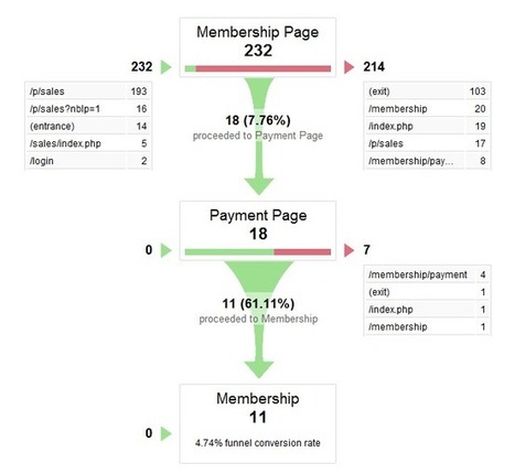
Remember, funnels measure the number of people who move through a series of steps in order to become a customer.

...

Funnels help you find the bottleneck in your customer acquisition.


Once you know where people drop off in large batches, you’ll know which part of your business needs the most improvement. And once you fix the problem, you’ll get more customers with the same amount of traffic. That’s the beauty of tracking funnels.


5 Best Practices for Building Funnels

1. Fewer Steps is Better than More Steps:

One of the easiest ways to increase the percentage of people who get through your funnel is to eliminate a step. Yup, just hack it out completely. Even if you have an amazing design, world-class copy, and a perfect product, you’ll still lose people at each step.

I want you to be RUTHLESS with your funnels. Hack and slash every unnecessary click, field, button, and page you can. Have no mercy.


2. Start With a Benchmark:

This applies to ALL your metrics, not just your funnels.

Based on your industry, business model, target market, and the alignment of the stars, you’ll find a huge difference in metrics from one site to the next.


3. Look for Bottlenecks

I already alluded to the best way to prioritize your funnel improvements.

When you’re looking at your entire funnel and trying to decide which step gets your attention first, start with the bottlenecks. In most funnels, there are one or two steps that aren’t really steps. They’re brick walls.

Your mission? Find your bottlenecks and patch them asap.


4. When A/B Testing, Track the Impact on the Entire Funnel

Once you find your bottlenecks, you’ll want to start launching improvements to see if you can fix them. The best way to do this is with an A/B test.

A/B tests typically track only the next step.

As soon as you start testing improvements in your funnel, test your changes on the ENTIRE funnel instead of just the next step. This way, you won’t slow your customer growth by accident. And yes, I’ve seen this happen.


5. Track People

There’s a myth that most marketers automatically believe. As soon as you start to track your funnel, you’ll assume that customers move orderly through it.

This is false.

People bounce around in funnels.

So how do we get around this? Use customer analytics so you can track people. Then you’ll know how many people moved through each step, even if they’re bouncing around beforehand..."


The article is analyzed with more information, examples, and some tools. Read full article here:

http://blog.kissmetrics.com/use-conversion-funnels/


Via Giuseppe Mauriello
No comment yet.