Robin Good: If you have not noticed yet, the next design trend is all about “undesign”.
"Undesign, a minimalist, tablet-friendly approach to website design."
It's not, like Dylan Tweney writes on Venturebeat, that design has become less important, but rather that it is receding in the background to leave space for direct access to content.
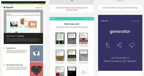
"Instead of pages crowded with links, buttons, and display type of all different sizes, designers were simplifying their layouts. The smartest designers stripped away the nonessential elements of their designs, leaving clean pages that let the eye focus on whatever images or words had been put there by writers and editors.
Why?
Because if the designers didn’t simplify their web pages, readers were going to use utilities like Readability and Instapaper to do it for them."
...
"One of the first apps to embrace this sort of rectangularity was Flipboard, which launched in mid-2010. It transformed the process of browsing RSS feeds into a magazine-like experience by putting stories into a boxy, more readable layout.
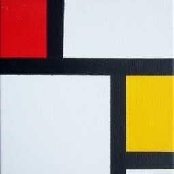
Last year's big fashion trend was the color block, and this year's tech trend follows suit: It's the square. More precisely, it's the big, colorful rectangle filled with a solid color (like Windows 8) or a photograph (like Pinterest)."
Right on the mark. 9/10
Full article: http://venturebeat.com/2012/03/07/dylans-desk-design-goes-minimal-online-and-off/


 Your new post is loading...


#WebConsultants @Nine0Media
@Nine0Media , #WebConsultants